How to Build a Website for a Charity or Non-Profit Organization on Squarespace

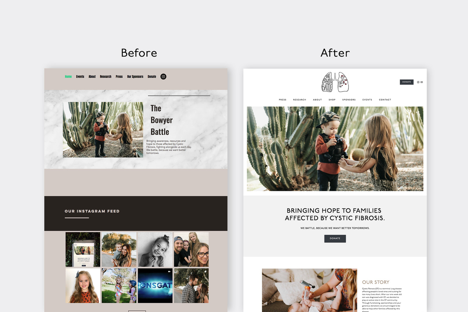
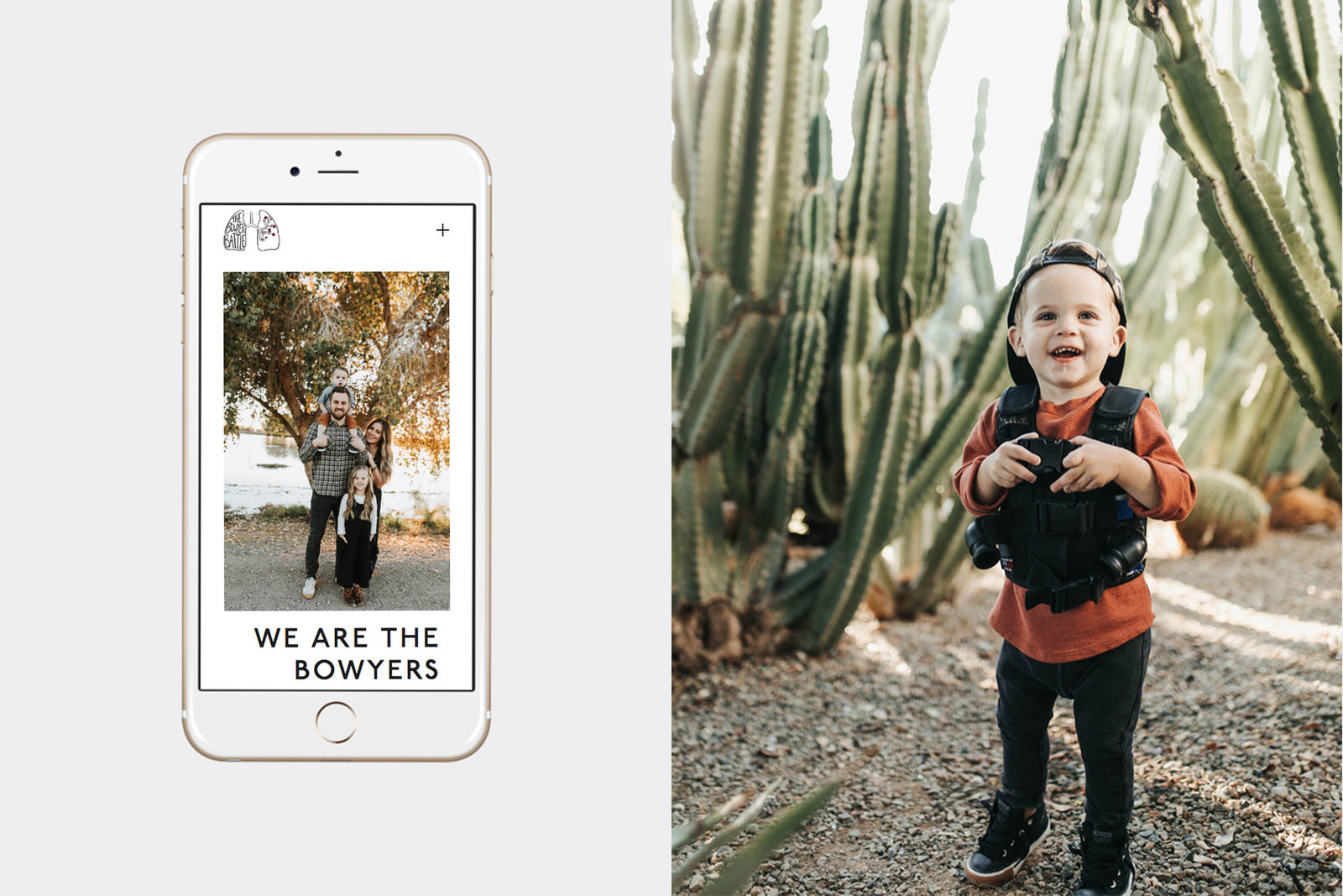
I recently built a website for the non-profit organization The Bowyer Battle. The Bowyer Battle is a non-profit organization that raises money for families affected by Cystic Fibrosis. The organization’s founder, Kylie Bowyer, learned her son Knox was diagnosed with Cystic Fibrosis when he was 2 weeks old. The moms behind The Bowyer Battle want to help strengthen the community and connection of families affected by CF and hopefully one day see a cure for this disease!

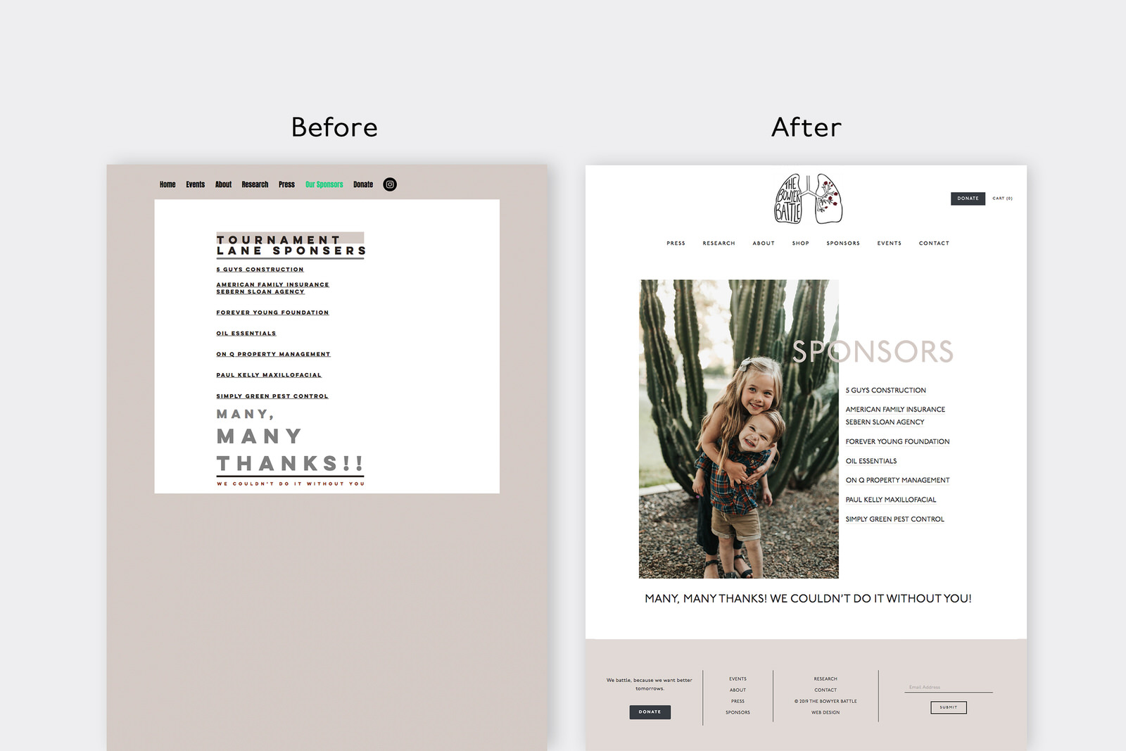
They had a DIY site on WIX, but were ready for an upgrade to better meet their goals for the organization. They wanted a better way to facilitate and track donations, as well as set up an online shop to sell products where proceeds contribute to the cause. They wanted to make the site more user-friendly, easier to navigate, and allow them to better advertise their fundraising events.
As I worked on building their website on Squarespace, I realized there isn’t a ton of information on building a non-profit or charity website on Squarespace out there, and for some of the features they asked for - such as a donation tracker - finding a good solution took a lot of time. Therefore, I decided to write a guide on building a website for non-profits or charity organizations on Squarespace, using The Bowyer Battle website as an example.
STEP 1 - Clearly define your target audience, the main objectives/goals of the website and decide how you want the website to feel to your viewers.
Establishing your target audience, objectives and mood at the beginning helps to keep the design focused and guides the design decisions to be more purposeful and impactful. For my clients, such as The Bowyer Battle, I provide a Design Questionnaire that asks them questions about their audience, goals and design aesthetic. The questions are really specific and dive deep so that I can have a really clear picture of their audience, goals and design aesthetic.
Before you design your charity website, ask yourself these questions:
Who is my ideal website visitor? (When answering this, think of just one person that typifies the audience you want to serve.)
How old are they? What is their gender, occupation and interests?
What is their lifestyle and personality like?
What are their core values, fears and goals?
What are their biggest points of pain or frustration as it relates to your organization?
How do you solve those problems?
Why do they care about your cause?
What opportunities do you provide for them to engage with your organization?
What are your top website goals? (Try to narrow it down to 1-2.)
What is the ONE main action you want someone to take when they land on your website?” “Choose three words to describe how you want your website to feel to website visitors.”
What is your most vital website information? What are your frequently asked questions?
How do you want your website to feel to your website visitors?
Are their any specific features you want included on your website? (Online Store, Donate Buttons, Donation Thermometer, Blog, Podcast, etc)
For the Bowyer Battle, I took their answers from the Design Questionnaire and combined them with the information I collected from our previous phone and email conversations in order to prepare a design brief that clearly outlines their target market, website objectives and the desired ethos of the website.

Design Brief Information for The Bowyer Battle:
Target Market - Kind, compassionate, big-hearted, family-centered and service-oriented people that are willing to learn about CF and contribute to the cause.
Website/Brand Objectives: The main goals of the website are to encourage donations and community involvement.
Desired Mood & Feel: Natural, classy and clean
Step 2 - Gather Inspiration
Now that you are clear on your audience, goals and the desired feel of your website, it is time to gather inspiration to help you form a design direction. I love to use Pinterest for this step. I created a new board specifically for The Bowyer Battle project, then pinned images that matched their desired mood which was “natural, classy and clean.” On the Design Questionnaire, The Bowyer Battle mentioned a few brands that they loved that had a similar natural, classy, clean vibe. One was a clothing brand and the other two were interior design brands. I went to those brand’s websites and pinned any images that evoked “natural, classy, clean.”
Then, I took to Pinterest to find more inspiration. I searched for things such as “Clean Interiors,” “Natural Design Elements,” “Classic Color Palettes,” “Clean and Natural Design,” “Natural Packaging,” “Classic Fonts,” etc. Any images that looked “natural, classy or clean” were added to the project board. Once I hit 161 pins, I decided that I had enough inspiration to pull from, lol. I then narrowed down the board to my favorite 31 pins that each represented “Natural, Classy, and Clean.”

Now you try. Create a new Pinterest board (or if Pinterest isn’t your thing, you can use Canva or even Google Docs or Microsoft PowerPoint - whatever is easy for you to gather inspiration images) and Pin away! And you really don’t need 161 pins here (I’m an overachiever). That can actually be a little overwhelming. Just shoot for 30-40 pins you love that reflect the desired feel of your website.
Step 3 - Create a Mood Board to guide the design direction of the website
A mood board helps to guide the direction of the design by showing specific design elements and imagery. There are a lot of different elements you can include and ways to make a mood board. When it comes to website design, I like to include the following parts on a mood board:
The brand’s logo
At least one image (from the brand or a stock photo) that will be featured on the website
A few inspiration images that evoke the feeling/mood we’re going for
The color palette for the website design
Optional: fonts, buttons, textures, shapes or other graphic elements that I may use on the website
The mood board is a refined, specific version of your inspiration board. Each part is thoughtfully added and purposefully included. For example, take a look at the mood board I put together for The Bowyer Battle website.

Image Credit: The Bowyer Battle, Madewell, Studio McGee
Mood Board & Logo Design Reasoning:
The imagery of the mood board is centered around home and family. The image of the family room and the kitchen represent gathering. Like the kitchen and family rooms of the home, where families tend to gather, the goal of the website is to bring together the community in support of families affected by cystic fibrosis. The Bowyer family and Knox are also featured to keep the focus on THE WHY behind the brand.
The feeling is natural, clean and classy. The imagery includes natural elements such as wood, leather and desert plants. The mood is bright, hopeful, passionate, clean, comfortable and timeless.
The neutral color scheme utilizes warm tones to keep the mood inviting and warm, while maintaining a clean, classic aesthetic.
The fonts are modern, bold and classy. They are easy to read and support a professional, but personable tone.
The button examples show ways that the fonts and colors may be utilized in the website elements.
To actually make the mood board, you could use Adobe Photoshop, Canva or Squarespace. To be honest, sometimes I’ll use a combination of all three! I like to use Canva to play around with different images until I find a combination I like. I use Adobe for the color palette. And then, I’ll add the Mood Board to a page on the website so that I can adjust the fonts and buttons right there so that the styling is already set for the rest of the website.
Step 3b (Optional) - Set up a Coming Soon Page to help build hype for the new website.
For The Bowyer Battle, after the Mood Board was approved, I put up a Coming Soon Page using a Squarespace cover page. That way, they could start sharing the upcoming website and build anticipation for the launch, while the rest of the site was built.
Step 4 - Set up the Page Navigation
For The Bowyer Battle, we decided to do the following pages:

Main Navigation
Press (Links to News Article about the organization)
Research (Links to Cystic Fibrosis News Today)
About
Shop
Sponsors
Events
Contact
Secondary Navigation (Button near the top)
Donate
Footer
Has links to all the pages listed in primary and secondary navigations

For non-profit/charity websites, you may also consider adding a blog page so that you can share field notes such as pictures from any events or from donation deliveries or as a way to update current organization needs.
Step 5 - Plan Out the Layout of Each Page
Whenever I build a website, my main goals are that it is user-friendly, easy to navigate, includes clear calls to action on every page and that it meets the project objectives that were outlined at the beginning. For example, for The Bowyer Battle website, the main goals were to make it easy for people to donate and participate in events. They wanted it to feel natural, classy and clean and I wanted the website to feel family-oriented as this is a mama-run organization that seeks to help other families also affected by cystic fibrosis.
To make it easy to donate - I created four different places to donate on the home page. The footer includes a donation button and the header at the top also includes a donate button. Throughout the design, I also added multiple places where people can subscribe to their email list to be notified of upcoming events, such as in the footer that shows up on every page. The Home page showcases upcoming events, as well as an entire page devoted to all the upcoming event details. I used lots of white space and geometric fonts to help it feel classy and clean. I used lots of The Bowyer Battle brand images throughout the design to provide a natural, family-friendly vibe.
Step 6 - Add in all the Content
Content refers to your text and images. If you are stumped on how to write your copy (the text), check out StoryBrand Marketing or Ashlyn Writes. I love the way they teach about copywriting and what to include on your website. As for images-they can make or break your website design, so I strongly encourage that you use high-quality images shot by a professional.
Quick tip: before adding your images to your site, make sure that they are optimized for the web by reducing the file size to 500kb or less (taking care to retain image quality in the process). Large image files slow site loading times which is bad news for SEO. To reduce image file sizes, I like to use jpeg mini.
Step 7 - Special Features
Each website will have different needs, so I ‘ll just talk about some of the special features that I used on The Bowyer Battle website, as it might be helpful for other non-profit organizations trying to build their website.
Instagram Feed & Social Media Icons
The Instagram Feed Block connects to their Instagram so that the images update on their website automatically. The social media icons link directly to their social media.

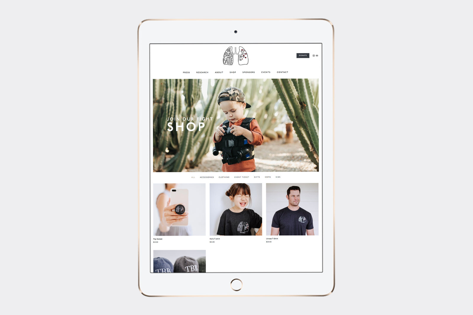
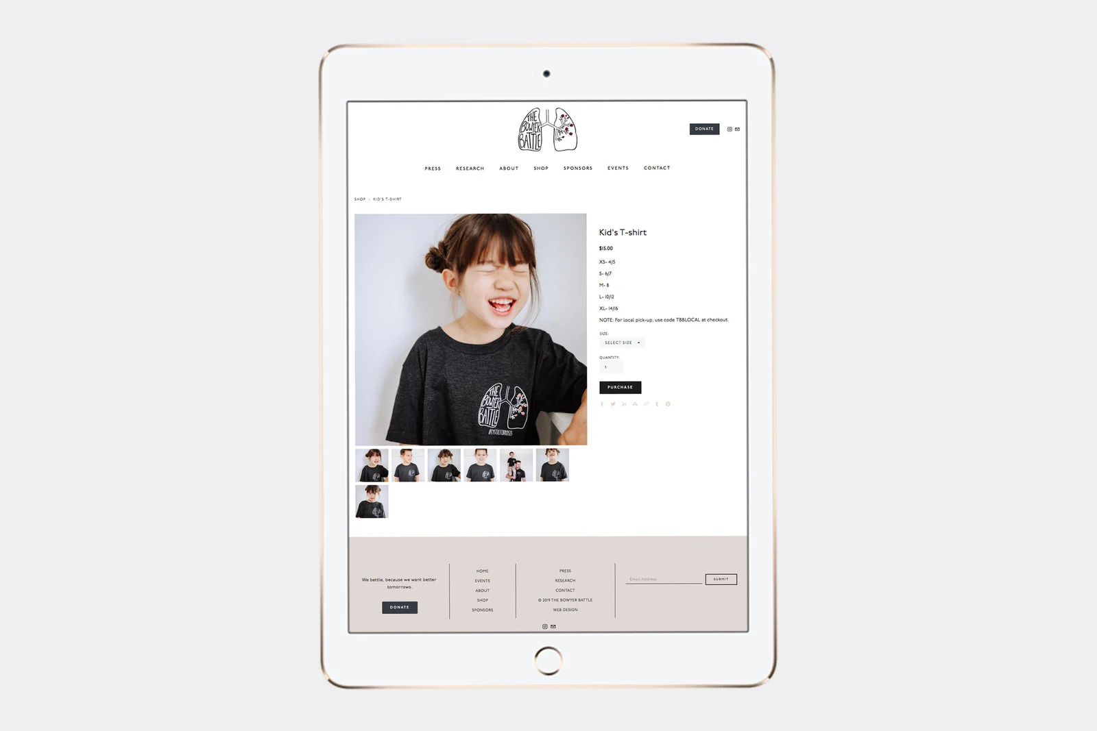
E-Commerce Capabilities & Shop Page
I added the first few products so that they can have a template for the individual product pages. When they need to add a new product, they can just duplicate another product page and edit it to fit the new product.
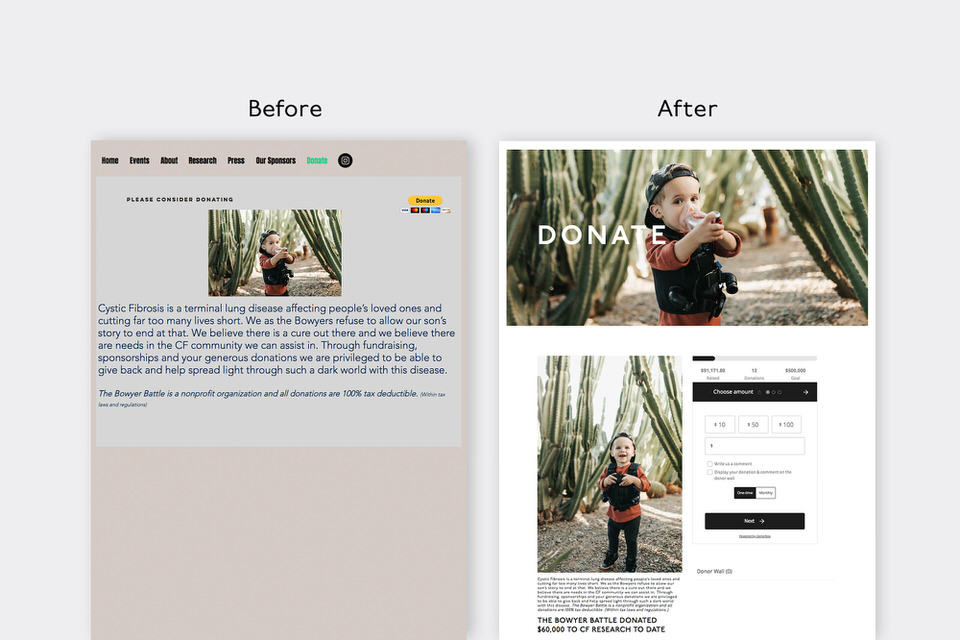
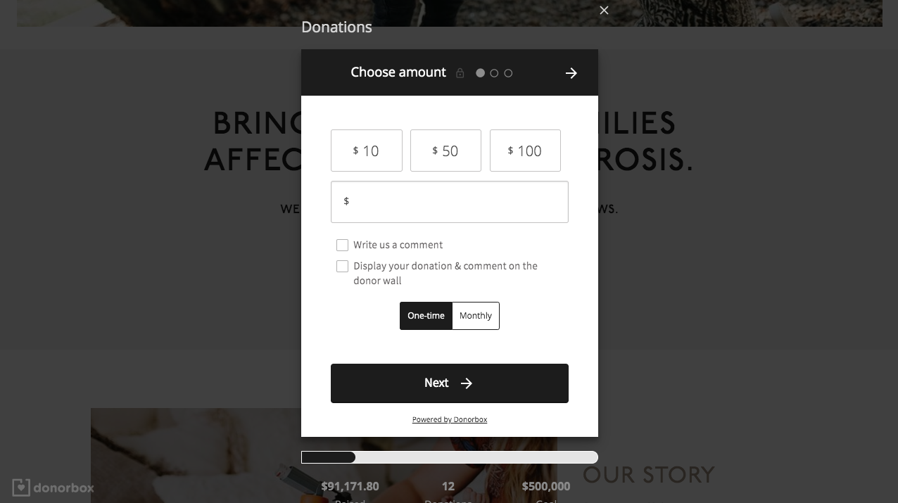
Donation Page
I used Donorbox to setup donation collection capabilities, and embed the Donorbox widget onto a page on the Squarespace website. I made sure to include the donation thermometer (some people also call this a fundraising meter or donation tracker) to show the progress of donations collected so far.
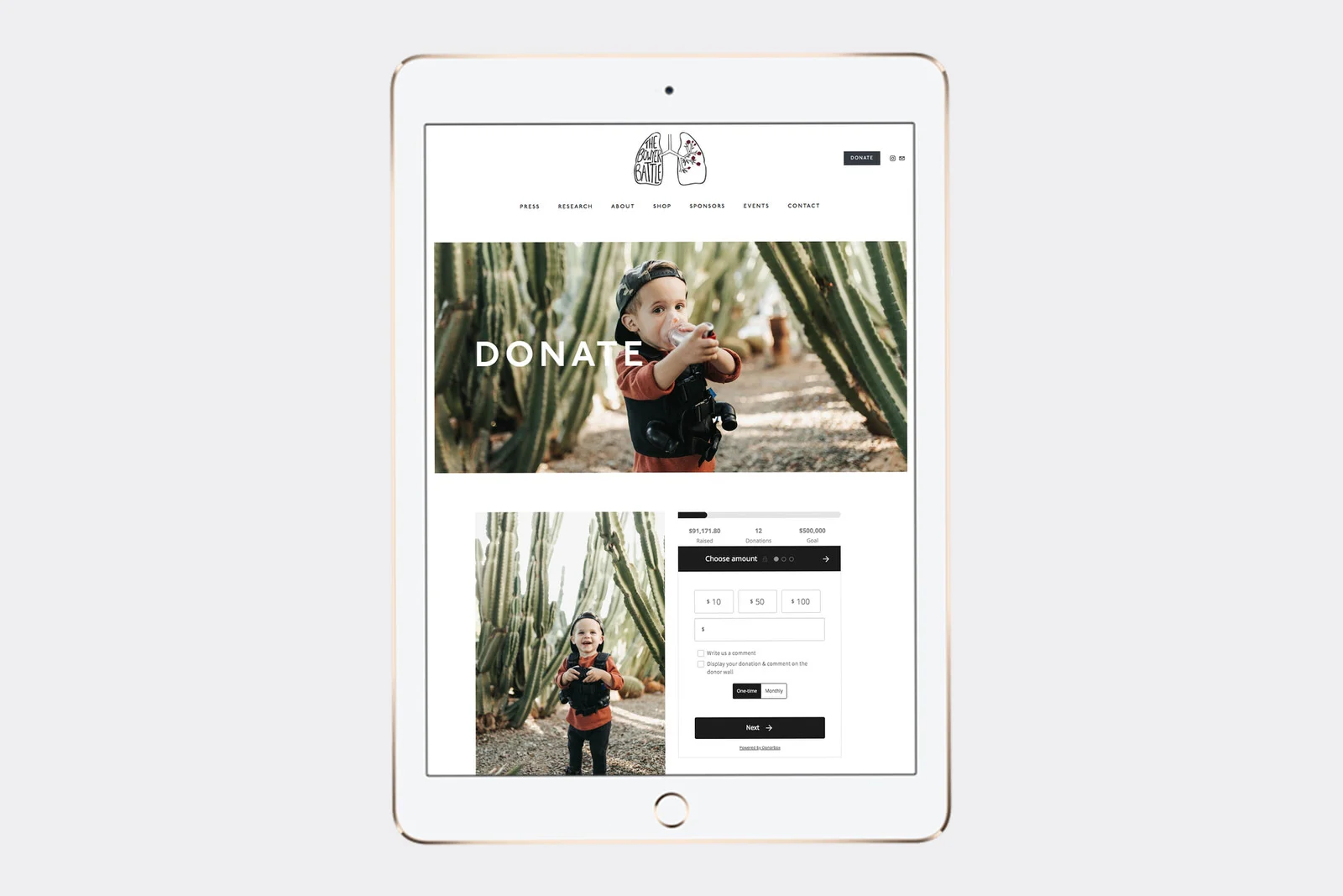
I also embedded Donorbox Donation Buttons throughout the site. When a viewer clicks on it, rather than take them to a different page, the donation area appears in a pop-up where they can pay right there.
Events Page
The events page lists upcoming events. When you click on the event, it takes you to the page with all the details for that event. Upcoming events also appear automatically on the Home page.

Email subscription for events
I added several email subscription collection forms throughout the site so that people can easily subscribe to be notified of upcoming events. In the image below, you can see the email subscription form in the footer.

Step 8 - Adjust the styling to match the mood board.
Using the Style Editor, adjust the fonts and colors so that it matches the font pairings and colors from the mood board and so that everything looks good. I like to go page by page to check that the styling works and looks good on every page.

Step 9 - Go page by page to check the tablet and mobile views of the website to make sure that each page looks good on multiple screen sizes.
While Squarespace automatically generates a tablet and mobile view of the website, they don’t always look perfect. Take the time to go page by page and adjust the styling or the content as needed so that everything is legible and the layout looks nice on multiple screen sizes.
Step 10 - Adjust the following backend settings:
Add Business Information (if you have an online store)
Add Region & Time Zone
Connect Social Media
Add Google Description
Add Page Descriptions
Enable AMP & Choose Blog Comment Settings (if you have a blog)
Remove Dates in Blog Post URLs
Secure site with HTTPS & HSTS
Enable Cookie Banner (link to privacy policy)
Choose Share Button Options
Turn on Pin It Button
Design and Connect a Custom 404 page
Add a favicon & social sharing image
Disable Squarespace Badge (personal preference)
Connect Google Analytics
Connect Google Search Keywords
Step 10b (If you have an Online Store) - You’ll Also Want to Set Up the following E-Commerce Backend Settings:
Connect Payment Processors
Disable/Enable Express Checkout - (Disable if you have more than one product)
Add your Store Policies (Which are linked on the Review & Purchase page of checkout)
Choose which price and tax details to include on the invoice
Customize customer notification emails if necessary
Shipping
Taxes
Connect Accounting Software if applicable
Connect Apps > for Shipping if necessary
Then, send a test order (with a real credit card!)
Step 11 - Prepare for the Launch
Before I launched The Bowyer Battle website, I provided two rounds of edits to make sure they loved it all and that everything was working perfectly. Then, I gave them a live Squarespace lesson where I taught them how to use and make changes to their website.
Before you officially launch your website, you can start building hype on social media and/or your current website. Give sneak peaks of the new design or an inside scoop of the process behind the scenes. Plan a promotion or something exciting for website viewers on launch day/week to encourage people to check out the new website and increase website traffic. Reach out to any promotional partners to help advertise those promotions/events. Then proudly launch your new website to the world!
And finally it is time to launch your website to the internet!

“Megan, you’re a miracle worker, we couldn’t have asked for anything more perfect. Thank you so so much!”
Are you feeling empowered after this post or a little overwhelmed?
If overwhelm is setting in, just know - you don’t have to Do It Yourself! I love building websites for non-profit and charity organizations!